CLIENT
Faculty of Mathematics & Information Science, Warsaw University of Technology
FORMAT
Stylesheet for R graphs
CREDITS
Concept: Przemysław Biecek
Design: Hanna Piotrowska
Development: MI² DataLab
BRIEF
DrWhy is the collection of tools for Explainable AI (XAI), created by Przemysław Biecek and MI² DataLab. It involves a set of data visualizations, demonstrating different aspects of predictive Machine Learning models and their performance.
The goal of the DrWhy’s redesign was to make the charts more readable, understandable and engaging for the users and, at the same time, to build a cohesive, scalable design system, which would also constitute a consistent visual identity for the project.
THE CHARTS
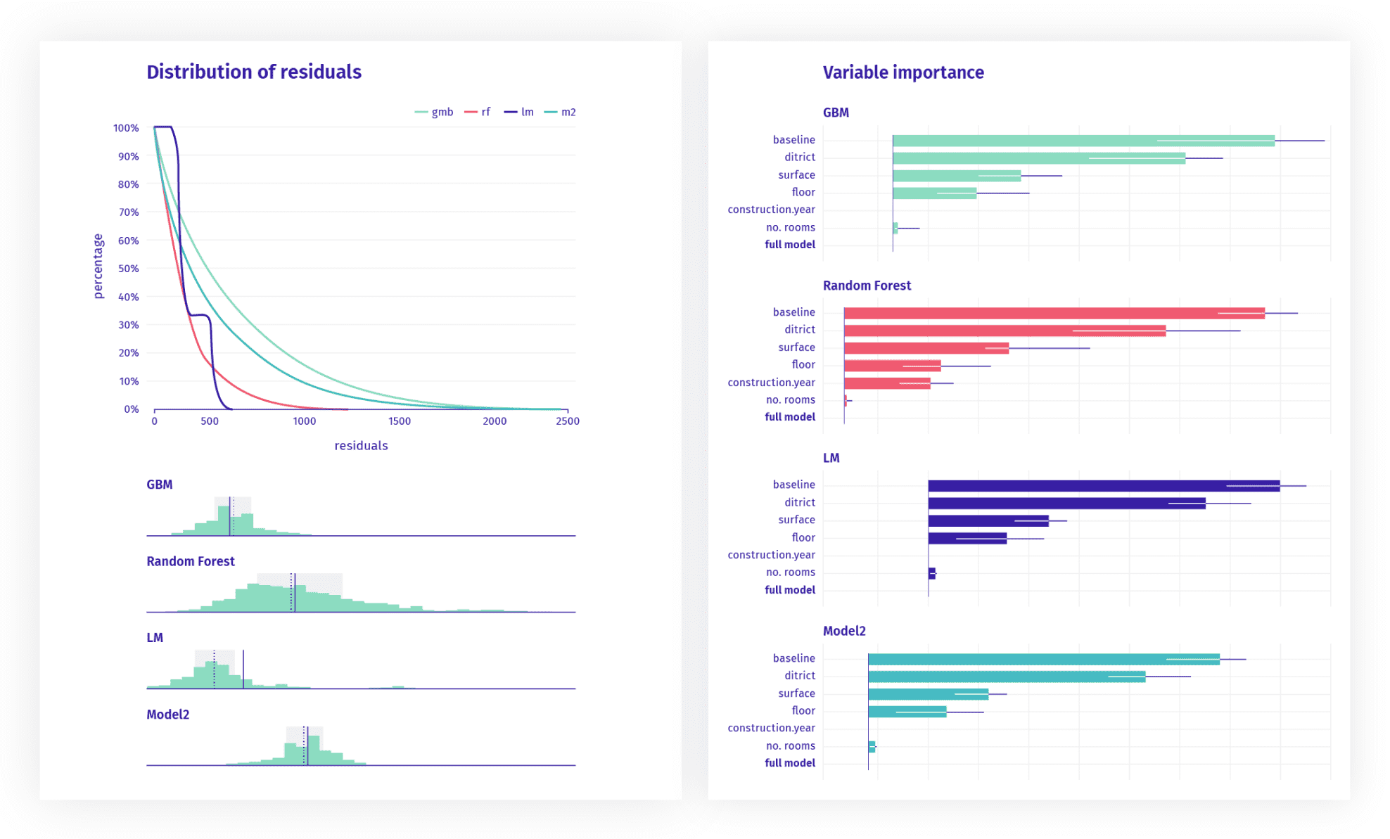
The charts show different aspects of Machine Learning models analysis, e.g. influence of the variables on the final prediction, attribution of categories to the computed groups and subgroups or models’ scores on diverse performance measures.
Check out our extended case study to learn more about specific charts.
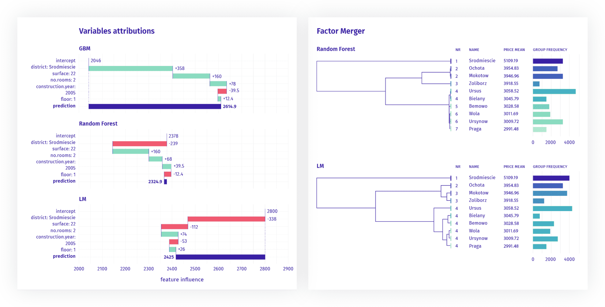
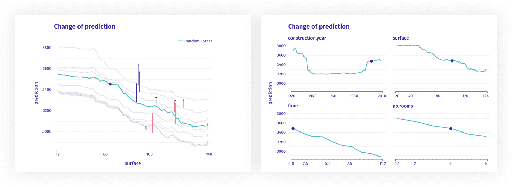
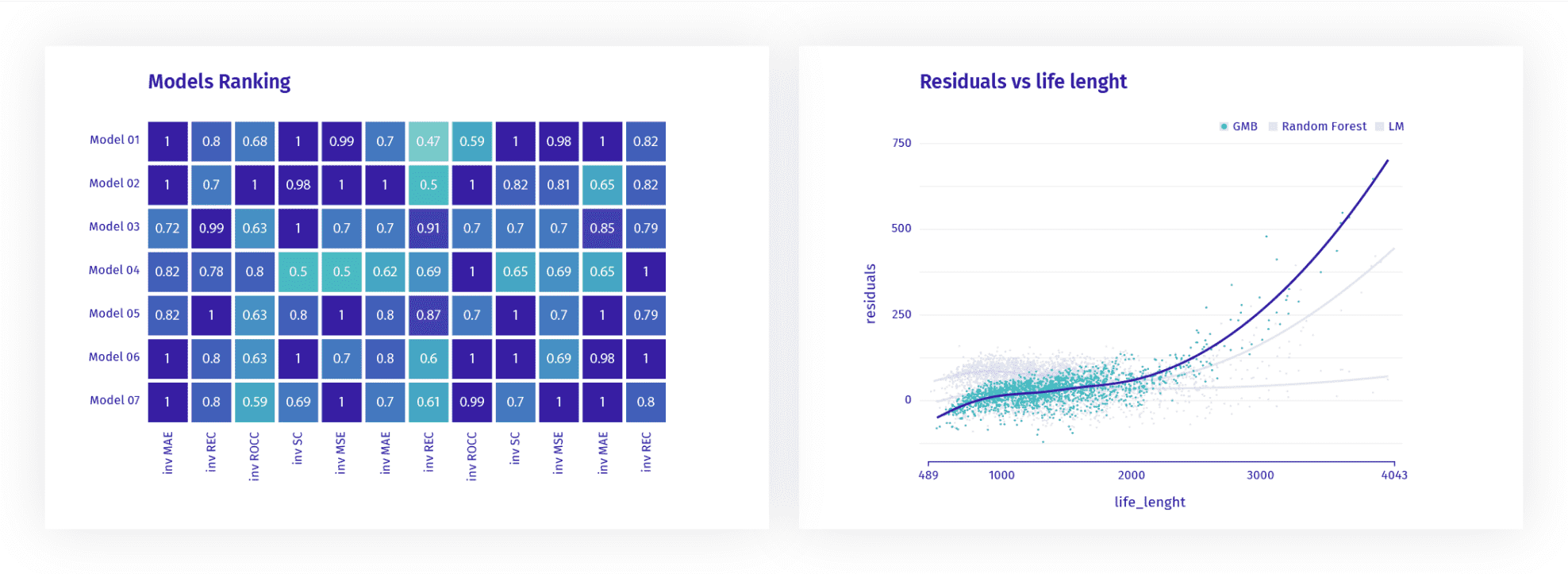
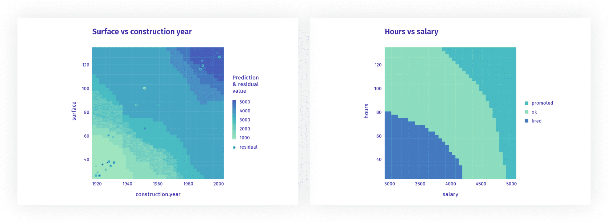
STYLE GUIDE
As the output, we created a style guide for all the charts, as well as general guidelines for charts that could be added to the tool in the future. The color palette is friendly for users with color vision deficiencies. The DrWhy.AI collection can be used in R or in Python.

PROPORTIONS
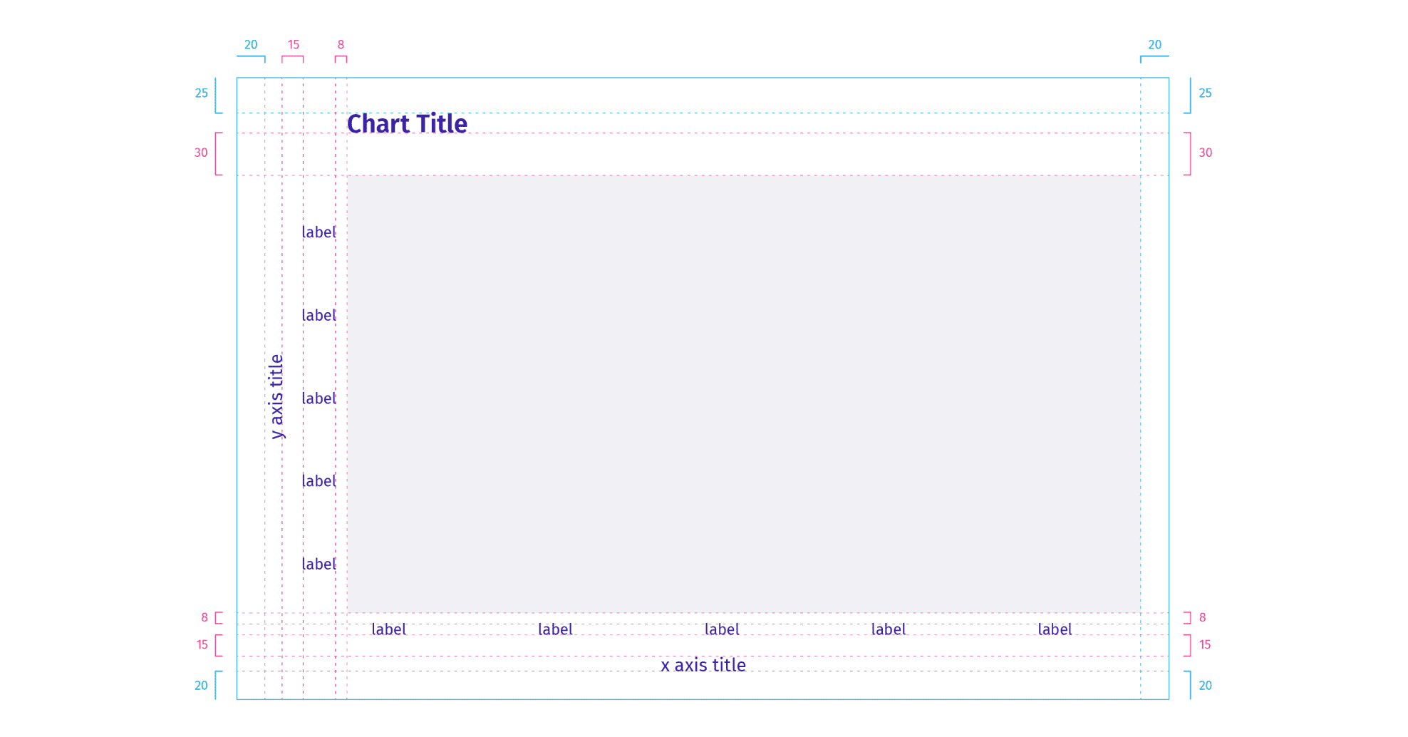
As the charts can be resized adjusting to the user’s viewport, we set some minimal margins and indents to be maintained in all media sizes. The inside spaces are fixed (marked with red lines). The outside margins (blue) are flexible and can be bigger than those indicated on the scheme.
COLORS AND TYPOGRAPHY
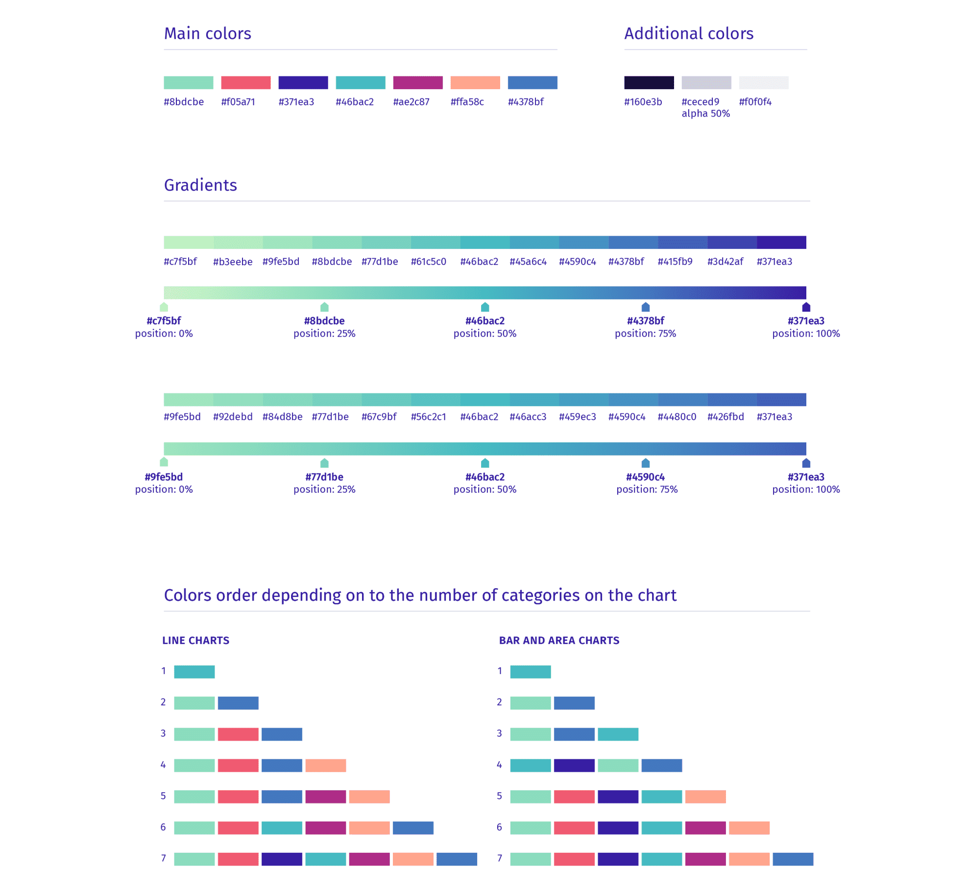
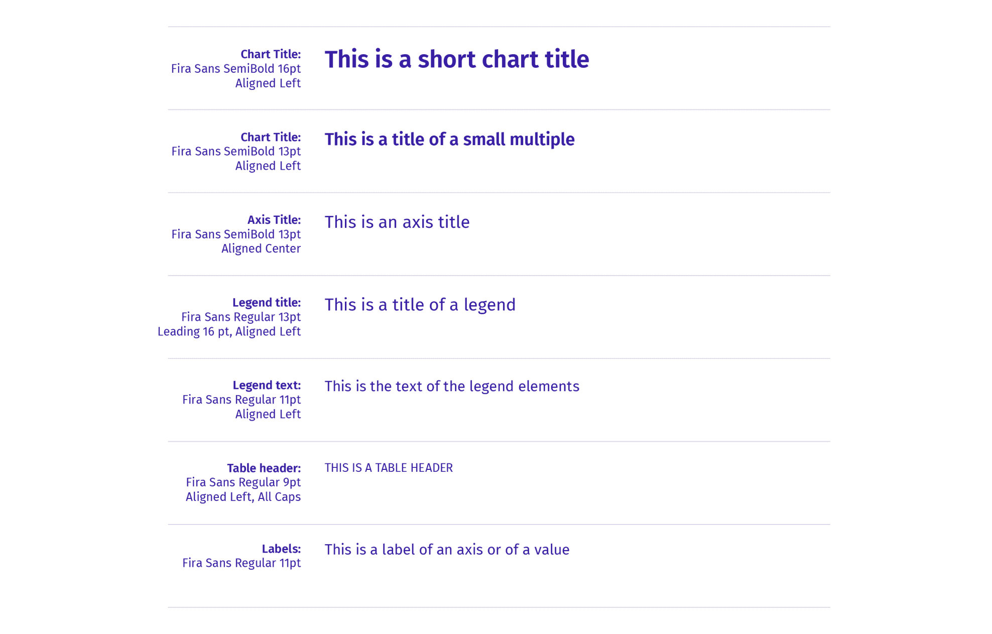
There are seven main colors for categorical data, as well as additional shades in the palette. The gradients are based on the cold hues from the main color set. Their shades can be applied to sequential or continuous data. The typography is based on Fira Sans font and one color.
PROCESS
The design process was preceeded by a deep understanding of the subject matter, possible ways of charts’ usage, as well as all the requirements and limitiations determined by the medium (the R plot generator, where e.g. the size of the chart depends on the size of the window, defined by each user individually). A series of possible solutions were tested and the final versions were implemented by the MI² DataLab team.